A guide to confident colour choices

Expert advice for transforming any space
Choosing the perfect paint for your home goes beyond simply picking your preferred colour. From understanding how natural light transforms a space to selecting the ideal finish for each surface, there are many elements to consider.
To help you navigate this process, we’ve gathered expert advice from Patrick O’Donnell, Brand Ambassador at Farrow & Ball. He shares his professional insights on how to create beautiful, well-balanced spaces.What to consider first when creating a room from scratch
When starting a room transformation, thoughtful planning is key, says Patrick. “Think about all the elements that are going to exist in your chosen room - from fabrics, furniture, flooring and of course, your wall and woodwork colours,” he advises.
His top tip? Order samples whenever possible and create a mood board - either physical or digital. This helps you see how all the components will work together.
Looking for inspiration? Patrick recommends browsing platforms like Pinterest or Instagram and flipping through design magazines.
But he also highlights a crucial - and often overlooked - element: lighting. “Both natural and artificial - this can make or break a room,” he stresses. “So never overlook this element, even down to where plug sockets will sit, no one wants lamp cables draped across the floor.”
Smart design choices for every scheme, space and layout
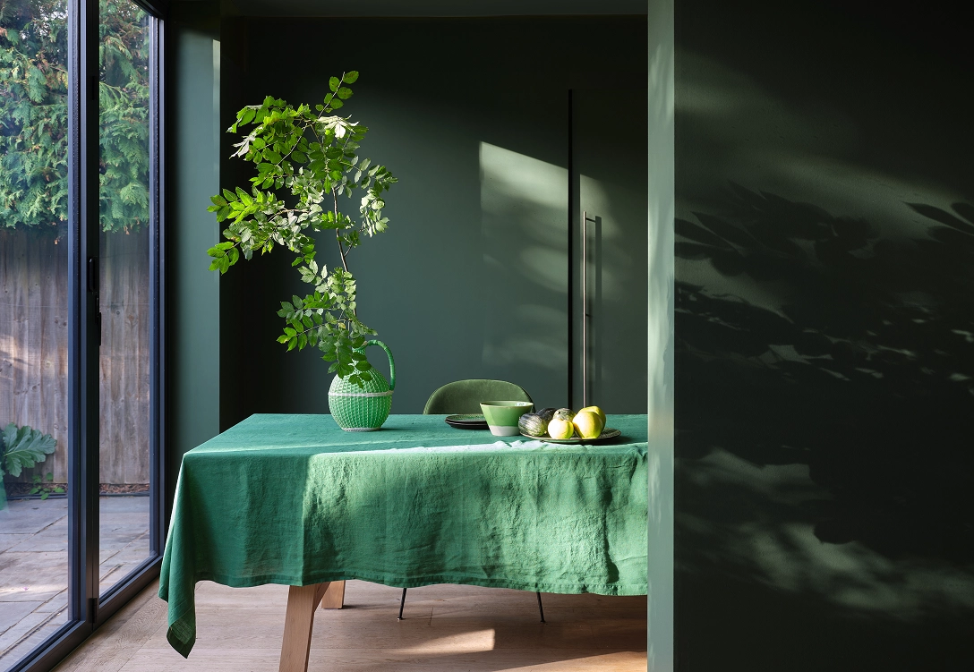
One of Patrick’s key insights is the impact of room orientation on colour selection. “The best way to decide on your paint colour for your walls is by looking at what direction the room is facing,” he explains.
For south-facing rooms, Patrick offers an encouraging perspective: “In these rooms, pretty much anything goes, which is thoroughly liberating! Although it is sometimes best to keep these rooms light to enhance the all-day sun.”
East-facing rooms have a unique charm, according to Patrick: “You get the natural morning light, which reacts beautifully to soft blues and greens such as Teresa’s Green or Pale Powder.”
West-facing rooms offer flexibility too: “These have the afternoon and evening sun, which is lovely and warm, so again most colours will work here .”
North-facing rooms are often seen as the most challenging - but Patrick has practical solutions.
“Here, you have two options,” he explains. “You can either use warm-based colours with elements of red or yellow like Joa’s White or Jitney, or endeavour with the limitations and embrace the dark and use moody inky tones such as Hague Blue or Railings!”
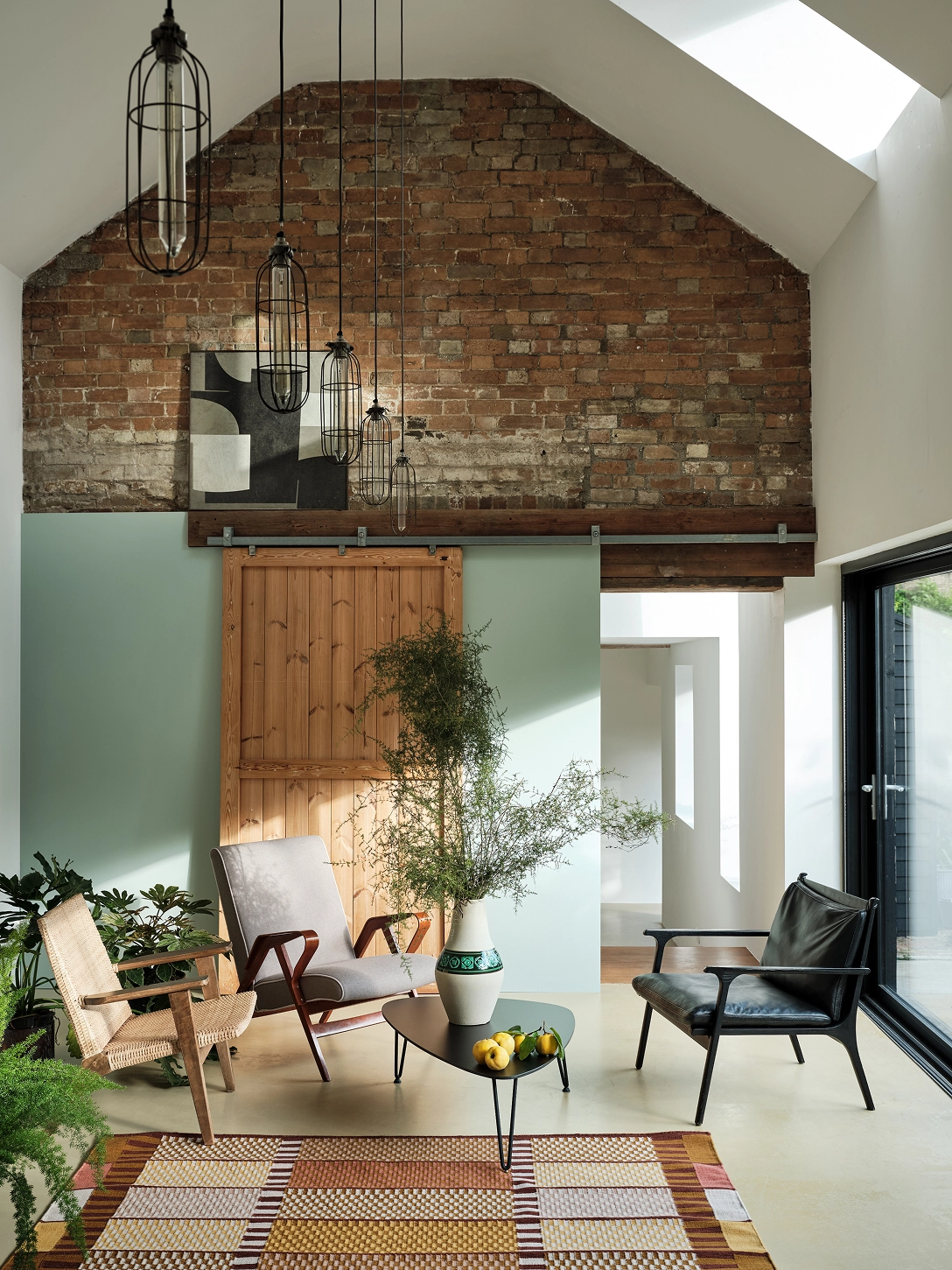
Patrick’s advice extends beyond walls – he encourages using the floor as part of your design palette.
“If your floorboards are suitable, painting them in Modern Eggshell can add a stylish touch,” he suggests. “In brighter rooms, you could use something rich and sophisticated like Salon Drab or Deep Reddish Brown. If light is limited, try a soft white such as Wimborne White or Snow White, which will help bounce more light around the room.”
How colour shapes neurodivergent experiences

Patrick’s pro tips
Patrick challenges conventional thinking when it comes to colour placement: “Why not carry your colour right up onto the ceiling for a glamorous, cocooned look?” he suggests. “An effortlessly chic look that has the added bonus of making your room feel taller as you will be less aware of where the wall height stops and ceiling starts.”
Go bold with your woodwork
Patrick encourages a fresh take on traditional trim: “Flip the usual convention of white woodwork on its head and choose a darker colour for your doors and skirting,” he advises. “This feels overtly modern without feeling overly trendy, adds subtle detail of interest to a room and works beautifully in urban and rural settings.”
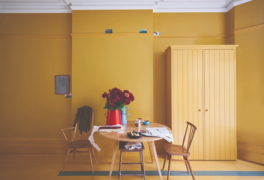
The return of yellow: A joyful comeback
Patrick is particularly enthusiastic about the revival of yellow - a once-popular colour hue making its way back into modern interiors.
“Yellow has disappeared off the decorating radar for a couple of decades,” he notes. “But it’s sneaking its way back into our hearts.” With more time spent at home, particularly during the summer, Patrick suggests embracing the uplifting power of cheery yellows.
His advice? Use it thoughtfully: “Yellow is an energising colour, so it’s great for kitchens and living rooms, but not so ideal for the bedroom!”
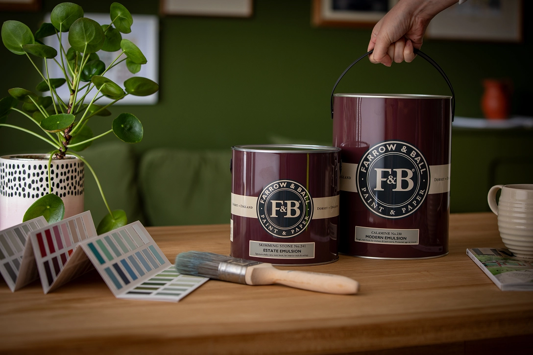
Choosing the right finish: Practicality meets style
Understanding paint finishes is essential - not just for aesthetics, but for how your space functions. With so many options available, it can feel overwhelming to choose the right one. Patrick recommends starting with practical needs.
“The main reason to consider finish is functionality,” he explains. “Does it need to handle heavy wear in a busy home? Can it cope with moisture in a bathroom or kitchen? Is it suitable for floors or radiators?”
While practicality comes first, Patrick also notes that finish can elevate a room’s style. Glossy walls can add glamour and reflect light, while ultra-matte finishes are ideal for hiding imperfections on older plaster.
From matte to gloss: Exploring paint finishes
- Dead Flat: Ultra matte (2% sheen), versatile for walls, wood and metal; washable and wipeable, but not bathroom-safe.
- Emulsion: Ideal for walls and ceilings; typically under 10% sheen. Durability varies - check product guidelines
- Eggshell/Satin: Designed for wood and metal; offers soft sheen (20-40%). Estate Eggshell suits general use; Modern Eggshell (40%) is tough enough for floors and cabinetry.
- Full Gloss: High sheen and durability, suitable for wood, metal and exteriors. Can also be sprayed on walls for a dramatic, lacquered effect.
With Patrick’s expert guidance, choosing the right paint becomes less about guesswork and more about understanding how colour, light and finish work together.
His approach empowers you to create spaces that are not only beautiful but also thoughtfully functional, tailored to how you live and feel in them.
Discover Farrow & Ball’s complete range of expertly crafted paints and finishes, including the ones mentioned in this guide at farrow-ball.com, and begin your colour journey.
Farrow & Ball is proudly a part of Hempel A/S