How colour shapes neurodivergent experiences
Moving beyond one-size-fits-all approaches
When designing spaces for neurodivergent individuals, there’s no one-size-fits-all colour palette. We sat down with Kathryn Lloyd and Jemma Saunders, Colour Specialists from Crown’s Colour Studio, to understand how they support clients such as designers and developers make thoughtful decisions around colour and neurodiverse needs.
“There is no such thing as a universal colour scheme for neurodivergence. Inclusivity means recognising and responding to individual sensory needs,” explains Kathryn.
Instead, the focus should be on how colour influences different neurological experiences, a topic that has never been more important for inclusive design.
The sensory environment profoundly affects focus, comfort and wellbeing and, ultimately, a person’s ability to participate fully in society.
Why colour matters
For many neurodivergent individuals, colour is not only seen but felt. It can be energising, soothing, or overwhelming. Some people are hypersensitive, experiencing colours with heightened intensity that can quickly lead to overload. Others are hyposensitive, seeking stronger sensory input to remain engaged.
The challenge for designers of communal spaces is to move beyond binary thinking. These are not “opposite” problems but different expressions of the same need: to design with sensory diversity in mind.
Colour schemes must reflect the needs of the users, which vary widely across groups. For example, research suggests that both older adults and some autistic individuals can find pure white uncomfortable, often because of glare and reflection. Softer, warmer tones may reduce this strain, though the best choice depends on the individual’s sensory profile, age and context.
A guide to confident colour choices

Beyond visual: The multisensory impact
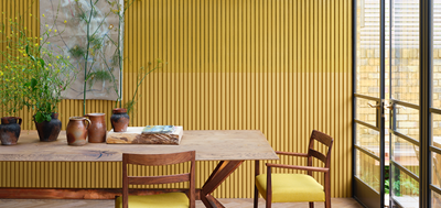
Successful neurodivergent-friendly environments recognise this interconnectedness. Designers may use muted tones in bedrooms to encourage decompression, while introducing more vibrant shades in communal areas to spark engagement.
From insight to impact
This is where specialist expertise becomes crucial. Crown Paints’ bespoke consultation service helps clients develop colour schemes grounded in real user needs. Consultants begin by understanding who will use the space, focusing on their age, sensory profile and routines, before assessing factors such as light levels and acoustics that shape how colour is perceived.
“The key is consultation: understanding who will use the space, how they experience colour, and what will help them thrive,” states Kathryn.
In a care home, for instance, warmer tones may be chosen to soften glare, while gentle colour transitions can support navigation and orientation. Every shade, finish and lighting combination contributes to how people feel, focus and connect within a space.
Ultimately, understanding how colour shapes neurodivergent experiences can transform environments from simply functional to genuinely supportive. By moving beyond stereotypes and embracing sensory diversity, we can design spaces that empower individuals to thrive.